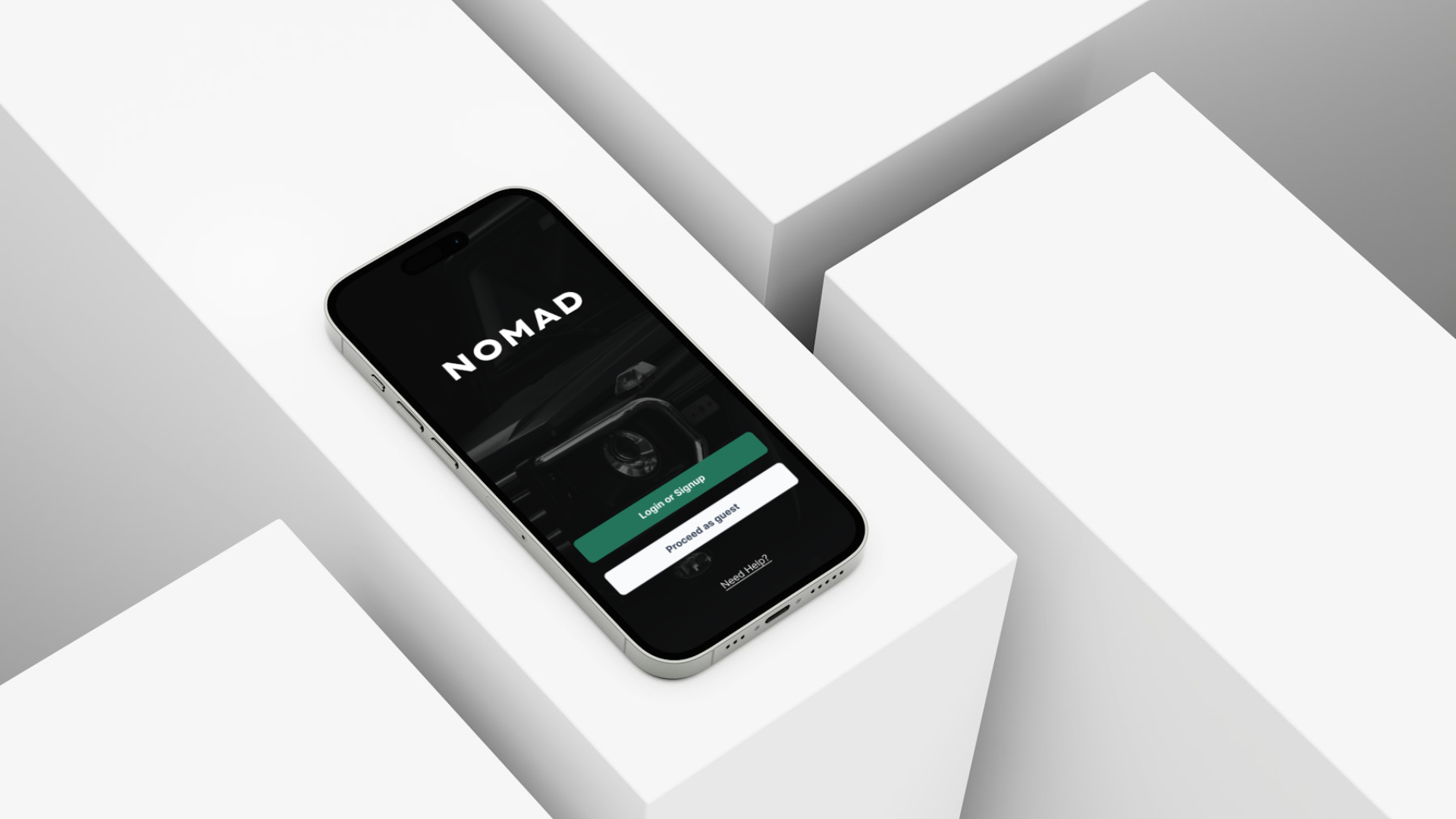
Transparent car rental app
Overview
I noticed car rental services have one thing in common: a bad reputation.
Apparently, some of these companies take advantage of the complicated terminology around insurance and extras to upsell.
How can we help users to make informed decisions when renting a car?
Role
UX/UI Designer
User Research, Wireframing, Prototype and Testing
2024
“61% of rental car drivers experience surprise charges and hidden fees. ”
01. Research
Not a lot of clarity in the industry
I wanted to know which car rentals people like the most, compare them and what are the pain points when drivers need to book a car using an app.
Here’s what I found:
Surveys: people really like Sixt + 57% drivers said they need more price clarity.
Comparing apps the most common problem was unclear terms of insurance and extras.
Usability Tests: most common pain point is that everyone struggled to understand the insurance terms and terminology, also there was a pattern about filters not matching mental models, unhelpful error messages, cognitive load from math, unsafe and pushy feeling.
“Get CDC with excess? I don’t know what that means. They are so pushy!”
02. Analysis
Drivers don’t understand what they are agreeing to pay for
- Price transparency need to be put front and center.
- Users want cheap and risk-free because vacations are already expensive.
- Addressing concerns at the right time and offering help makes people feel safe.
- Returning users produce more revenue than one-timers
03. Concept
Loud and clear! Putting transparency first
The app needed to be easy to understand and help users feeling in control, here are some ways to achieve that:
Value options selected by default
Remind users what they are getting
Clear language and terminology
Simplify math to reduce cognitive load
Simplified and more constrained filter options
Live results count to show filter feedback
Offer assistance and support lines at all times
Explain what’s wrong and how to solve it in error messages
04. First round of improvements
Too much info in screen!
I cluttered screens with too much info, forcing users to scroll to complete tasks.
That’s clumsy.
I fixed it by making it available, but optional.
05. Conclusion
Lessons learned
I spent weeks wiring a prototype that crashed because it was huge: It was so heavy that It couldn’t be tested on phones. For usability testing, focusing on certain tasks is okay.
Design systems, components and consistency. A staple: Designing without a system is messy and it’s easy to have consistency errors. Never again.
Usability tests are a must: Without them, I probably wouldn’t have realised how confusing the insurance terms are for people. They are such a rich tool.


